Users and accounts with Devise
In this chapter, we are going to allow users to log in and log out of the application using Devise. In previous versions of Rails, Devise was plug-and-play; however, the release of Rails 7 with Turbo as the default has, at least for now, made the Devise setup process a bit of an adventure.
In the future, expect the typically simple Devise setup process to be restored once Devise adds full support for Turbo. For now, we will work through the tricky parts together.
We will also take some time in this chapter to create our first Stimulus controller to power toast-style flash messages. This will be our first look at a piece of the Hotwire stack and a good chance to warm up our JavaScript muscles.
We will finish this chapter by adding a basic application layout to prepare for the key features of the application — Job Postings and Applications — that we will begin constructing in the next chapter.
Before you begin, please note that you will need Redis running locally. If you do not, you may encounter errors like the errors described here. Check that redis is running from your terminal with redis-cli ping.
Adding an account model
We will start by adding a basic Account model.
We are building an application for business users, so we can expect multiple users to need to share access to the same data. The Account model is how we will group those users and their job postings and applicants together under one entity.
Later, we will use the Account model to build a public-facing list of job posts and a user management interface. For now it will just be a simple, single-attribute model.
Create the Account model with the Rails model generator and migrate the database. From your terminal:
rails g model Account name:string
rails db:migrate
Update the account with a simple validation to ensure that a name is present:
class Account < ApplicationRecord
  validates_presence_of :name
end
Incredible stuff, we are cruising already!
Install Devise
Please note that this book was written (way) before Devise added native support for Hotwire/Turbo. You no longer need to jump through all the hoops that we jump through in this chapter like using a fork of the gem and overriding controllers. Thanks to the hard work of the Devise team, you can just install Devise as normal without using my fork, and without making your own controllers. The steps I outlined in this chapter will still work fine, but they are no longer necessary.
Devise remains the most popular authentication solution in Rails-land, with good reason. While some folks encourage you to build your own authentication, and Rails 7 has made it easier to take this route, I still prefer letting Devise do the heavy lifting so that is the route we will take.
As mentioned, Devise and Turbo-enabled Rails 7 do not yet work well together. Because of this, we are going to use a fork of Devise in the application. This fork brings in important PRs to support Rails 7 and Turbo in Devise. Using this fork should not be necessary for much longer, but it is a simple solution to a Turbo-compatible Devise version while we wait for the official Devise package to catch up.
In your Gemfile:
gem 'devise', branch: 'rails_7', github: 'DavidColby/devise'
And then from your terminal:
bundle install
Next, run the Devise installation tasks from your terminal, and create a User model:
rails generate devise:install
rails g devise:views
rails g devise User account:references first_name:string last_name:string
Update the generated migration to ensure that the account reference is properly added with a uuid column type:
# frozen_string_literal: true

class DeviseCreateUsers < ActiveRecord::Migration[7.0]
  def change
    create_table :users, id: :uuid do |t|
      ## Database authenticatable
      t.string :email,              null: false, default: ""
      t.string :encrypted_password, null: false, default: ""

      ## Recoverable
      t.string   :reset_password_token
      t.datetime :reset_password_sent_at

      ## Rememberable
      t.datetime :remember_created_at

      ## Trackable
      # t.integer  :sign_in_count, default: 0, null: false
      # t.datetime :current_sign_in_at
      # t.datetime :last_sign_in_at
      # t.string   :current_sign_in_ip
      # t.string   :last_sign_in_ip

      ## Confirmable
      # t.string   :confirmation_token
      # t.datetime :confirmed_at
      # t.datetime :confirmation_sent_at
      # t.string   :unconfirmed_email # Only if using reconfirmable

      ## Lockable
      # t.integer  :failed_attempts, default: 0, null: false # Only if lock strategy is :failed_attempts
      # t.string   :unlock_token # Only if unlock strategy is :email or :both
      # t.datetime :locked_at

      t.references :account, foreign_key: true, type: :uuid
      t.string :first_name
      t.string :last_name

      t.timestamps null: false
    end

    add_index :users, :email,                unique: true
    add_index :users, :reset_password_token, unique: true
    # add_index :users, :confirmation_token,   unique: true
    # add_index :users, :unlock_token,         unique: true
  end
end
Migrate the database to create the Devise-powered Users table. From your terminal:
rails db:migrate
And update config/environments/development.rb to set a default mailer url, as described in the Devise readme.
config.action_mailer.default_url_options = { host: 'localhost', port: 3000 }
Next, update config/routes.rb to define different root routes for authenticated users and visitors.
Rails.application.routes.draw do
  devise_for :users
  get 'dashboard/show'

  authenticated :user do
    root to: 'dashboard#show', as: :user_root
  end

  devise_scope :user do
    root to: 'devise/sessions#new'
  end
end
Here, we removed the previous root that sent all users to the dashboard and replaced it with two root routes, one that applies to authenticated users, and another that applies when an anonymous user visits the application.
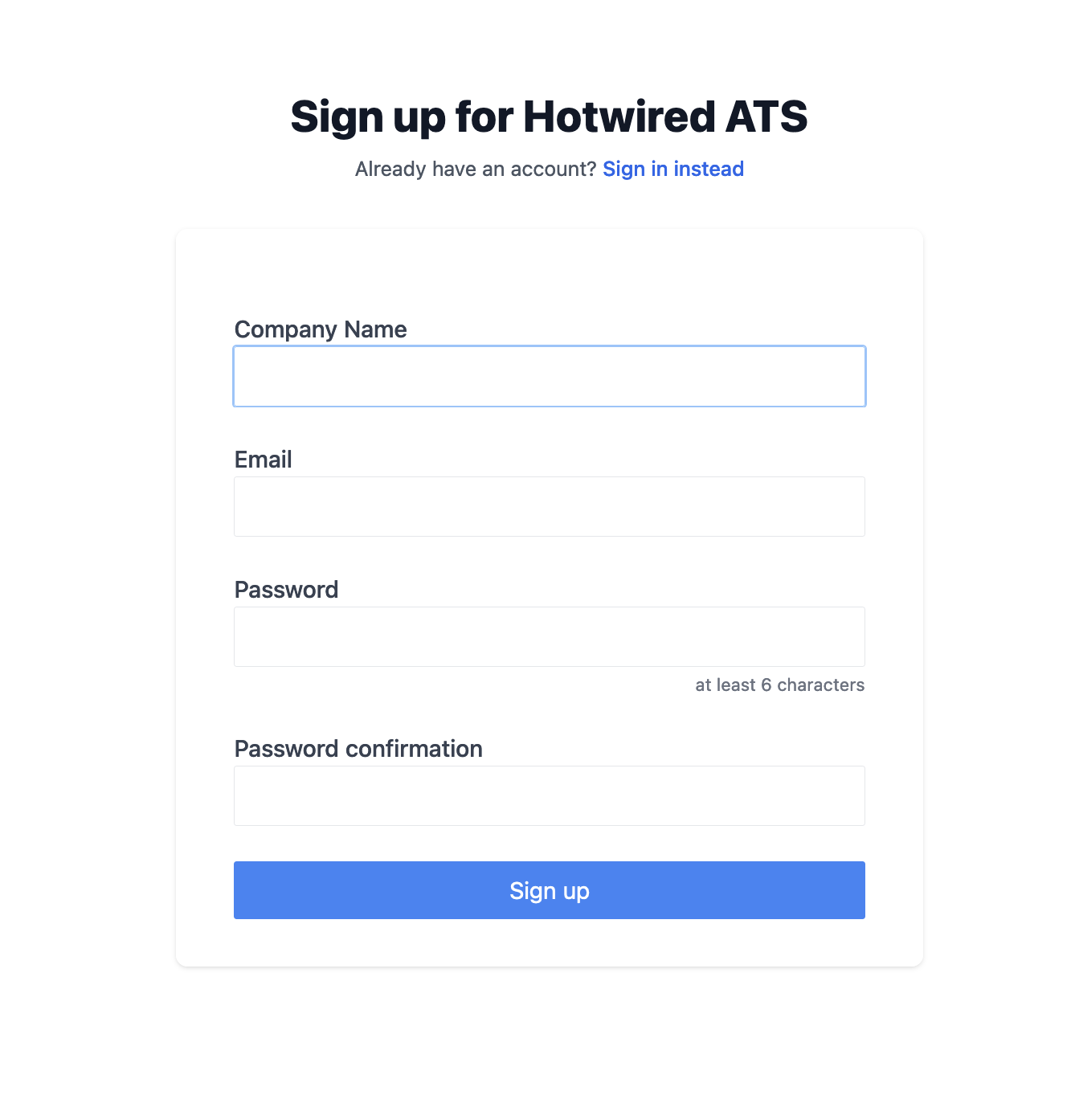
Build the sign-up flow
When a user signs up for an account in Hotwired ATS, we need to create an Account associated with that user, and we would like the account to have a meaningful name. In B2B applications, a company name is often the most meaningful identifier, so capturing this information during sign up is always helpful. To capture this extra information, we will need the Devise registration form to be more sophisticated than the default Devise form.
Our goal is to allow the user to enter their company name and email address on a form. When they submit the form, our server will create both an account and a user associated with the account.
While we are working on this feature, we will also patch up a small hole in Devise’s Turbo compatibility by ensuring form errors are rendered when a sign up fails.
To get started, run the Devise controller generator from your terminal:
rails g devise:controllers users -c=registrations
This generates a Devise registrations controller in app/controllers/users/registrations_controller.rb that we can override, which we will do with this code:
# frozen_string_literal: true

class Users::RegistrationsController < Devise::RegistrationsController
  before_action :configure_sign_up_params, only: [:create]

  def new
    build_resource
    resource.build_account
    yield resource if block_given?
    respond_with resource
  end

  def create
    build_resource(sign_up_params)

    resource.save
    yield resource if block_given?
    if resource.persisted?
      if resource.active_for_authentication?
        set_flash_message! :notice, :signed_up
        sign_up(resource_name, resource)
        respond_with resource, location: after_sign_up_path_for(resource)
      else
        set_flash_message! :notice, :"signed_up_but_#{resource.inactive_message}"
        expire_data_after_sign_in!
        respond_with resource, location: after_inactive_sign_up_path_for(resource)
      end
    else
      clean_up_passwords resource
      set_minimum_password_length
      # set status to unprocessable_entity so form errors are rendered
      respond_with resource, status: :unprocessable_entity
    end
  end

  protected

  def configure_sign_up_params
    devise_parameter_sanitizer.permit(:sign_up, keys: [
      account_attributes: [:id, :name]
    ])
  end

  def after_sign_up_path_for(resource)
    root_path
  end
end
There is a lot going on here, much of it built-in Devise code. Let's zoom in on the important pieces:
def configure_sign_up_params
  devise_parameter_sanitizer.permit(:sign_up, keys: [
    account_attributes: [:name]
  ])
end
Here, we are overriding Devise’s permitted params method with our own, so we can whitelist the account name attribute from the submitted sign up form.
def new
  build_resource
  resource.build_account
  yield resource if block_given?
  respond_with resource
end
In the new action, we initialize an Account object (resource.build_account) for the user (referred to as a resource in Devise parlance) before rendering the sign up form.
respond_with resource, status: :unprocessable_entity
The last important change is ensuring that validation errors in the create action respond with an unprocessable_entity status code. Turbo requires this status code to properly handle failures. Without it, users would not receive any feedback on a failed sign up attempt.
With the registration controller updated, we now need to update our routes again to tell Devise to route registration requests through our custom controller:
devise_for :users,
  path: '',
  controllers: {
    registrations: 'users/registrations'
  },
  path_names: {
    sign_in: 'login',
    password: 'forgot',
    confirmation: 'confirm',
    sign_up: 'sign_up',
    sign_out: 'signout'
  }
# Snip
Here we also took the opportunity to define custom path_names, so our urls and url helper methods are a bit easier to read.
Now that the custom controller is in place, let’s turn to the sign up form presentation.
Add a basic sign up page layout in app/views/devise/registrations/new.html.erb:
This is just regular HTML and ERB, with some Tailwind classes applied. The really important piece to note is:
This fields_for section is how we capture the account data along with the user data.
With the form built and the custom controller implemented, our last step in the sign up process is to configure the association between Accounts and Users in the models.
In app/models/account.rb:
class Account < ApplicationRecord
  validates_presence_of :name

  has_many :users, dependent: :destroy
end
And then in the User model:
class User < ApplicationRecord
  devise :database_authenticatable, :registerable,
         :recoverable, :rememberable, :validatable

  belongs_to :account
  accepts_nested_attributes_for :account
end
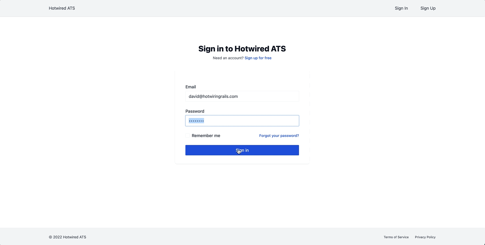
With these relationships in place, we can now head to http://localhost:3000/sign_up and create an account. We can also sign in to an existing account from http://localhost:3000/login.
To make Devise compatible with Turbo and Rails 7, we need to adjust logout functionality. By default, when a user logs out, Devise returns a 204 response code, which Turbo Drive does not know how to properly handle.
To work around this, we need to override Devise’s default SessionsController. From your terminal:
rails g devise:controllers users -c=sessions
And fill in that controller with:
class Users::SessionsController < Devise::SessionsController
  def destroy
    super do
      return redirect_to root_path
    end
  end
end
Here, we are overriding only the destroy action, which will allow the rest of the session actions to use the default Devise actions. In the destroy action, we redirect to the root_path after the user signs out, which Turbo Drive handles nicely.
This technique was described here and like much of this section will (hopefully) not be needed in the future once Devise has time to catch up with Turbo.
As with the custom registrations controller, we need to update the routes to use the custom sessions controller:
controllers: {
  registrations: 'users/registrations',
  sessions: 'users/sessions',
},
We will add the logout button to see this change in action later in this chapter. If you would like to test it now, you can add a temporary logout button to the Dashboard show page:
Form styles
One common critique of Tailwind is the potential for a class soup in markup, especially for elements like inputs and buttons, which often need many Tailwind classes applied.
One way to avoid class soup is to create our own custom classes that apply Tailwind classes. This gives us neat markup while continuing to use Tailwind's classes internally
From the command line:
touch app/assets/stylesheets/forms.css
And fill that in:
@layer utilities {
  .btn {
    @apply px-8 py-2 hover:cursor-pointer focus:outline-none focus:ring-2 focus:ring-offset-1 rounded-sm;
  }
}
.btn-primary {
  @apply btn bg-blue-500 hover:bg-blue-700 text-white focus:ring-blue-500;
}
.btn-primary-outline {
  @apply btn border border-blue-500 text-blue-700 hover:bg-blue-700 hover:text-white focus:ring-blue-700;
}
.checkbox-group label {
  @apply ml-2 block font-medium text-gray-700 cursor-pointer;
}
.checkbox-group input {
  @apply h-4 w-4 rounded bg-white text-blue-500 border-gray-200 rounded-sm text-lg focus:ring-1 focus:ring-blue-300 focus:border-blue-300;
}
.form-group label {
  @apply block font-medium text-gray-700 cursor-pointer;
}
.form-group input, .form-group select {
  @apply appearance-none w-full max-w-prose bg-white text-gray-700 border-gray-200 rounded-sm focus:ring-1 focus:ring-blue-300 focus:border-blue-300;
}
.form-group label.is-invalid {
  @apply text-red-500;
}
.form-group input.is-invalid {
  @apply border-red-500 focus:ring-red-600 focus:border-red-600;
}
.form-group input[type=file]::file-selector-button {
  @apply btn bg-white border border-blue-500 text-blue-700 hover:bg-blue-700 hover:text-white focus:ring-blue-700 outline-none text-sm shadow-none;
}
Here we use the @apply directive to build our default styles with Tailwind’s built-in classes.
This is Tailwind-specific functionality that is not particularly important to what we are building. Do not stress too much about the inner workings of this stuff!
While we could style everything with regular CSS rules, using @apply is useful if we later decide to redefine the color scheme or sizing rules across the application.
Since we are using things like text-gray-700, if we later change what color gray-700 is, we do not need to change our form styles, they will Just Work.
For these new classes to take effect, we need to import the new forms.css file into application.tailwind.css:
@import "tailwindcss/base";
@import "tailwindcss/components";
@import "tailwindcss/utilities";
@import "forms.css";
Head over to the registration page, and you should see a nice looking form with our new form styles applied.
We can reuse these styles on the sign in page, app/views/devise/sessions/new.html.erb:
Beautiful. Let's now work on flash messages, so we can communicate with users after requests complete.
Add flash messages
In our application, we will render flash messages as toasts, which appear briefly in the bottom-right corner of the screen and then disappear
We will use flash messages for transient messages that users can quickly read and process.
When we finish, our flash messages will look like this:

The toast that we are building is adapted from the wonderful tailwind-stimulus-components. This library provides common UI components that are built with Stimulus and Tailwind. We could directly use the alert component from this library, but we are here to learn and will write our own Stimulus controllers whenever possible.
To begin, create a shared directory and flash partial, from your terminal:
mkdir app/views/shared
touch app/views/shared/_flash.html.erb
And update the flash partial:
Along with all the Tailwind classes, we have a few important items to call out.
We are appending a class to the toast body with flash_class(level). This is a helper method has not yet been defined. Let’s add it now in app/helpers/application_helper.rb:
module ApplicationHelper
  def flash_class(level)
    case level.to_sym
    when :notice
      'bg-blue-900 border-blue-900'
    when :success
      'bg-green-900 border-green-900'
    when :alert
      'bg-red-900 border-red-900'
    when :error
      'bg-red-900 border-red-900'
    else
      'bg-blue-900 border-blue-900'
    end
  end
end
This method returns Tailwind classes to change the color of the toast based on the type of flash message that we are displaying to the user.
The other important part of our flash partial is <%%= inline_svg_tag 'close.svg', class: 'h-4 w-4 inline-block' %>. This inline_svg_tag method allows us to render svgs easily, but it comes from a gem we have not added to the project yet. Let’s fix that next.
Add the gem to your Gemfile and install it from the terminal with:
bundle add inline_svg
Restart the Rails server after installing the gem and then create the close.svg file from your terminal:
touch app/assets/images/close.svg
And fill that in with:
This svg, and all of the other svgs we will use in this book are from the Hericons icon library.
With those pieces in place, the flash partial is ready to go, but a partial that never gets rendered is not very helpful. To make these toast-style flash messages work, we need to render flash messages in the application layout and show and hide them with Stimulus.
Let's build the Stimulus controller next.
We can use the generator provided by stimulus-rails any time we need to add a new Stimulus controller to our application. From your terminal:
rails g stimulus alert
The generator creates a new file in app/javascript/controllers and runs stimulus:manifest:update to register the new controller in app/javascript/controllers/index.js.
Update the new controller at app/javascript/controllers/alert_controller.js with:
import { Controller } from 'stimulus'

export default class extends Controller {
  static values = {
    closeAfter: {
      type: Number,
      default: 2500
    },
    removeAfter: {
      type: Number,
      default: 1100
    },
  }

  initialize() {
    this.hide()
  }

  connect() {
    setTimeout(() => {
      this.show()
    }, 50)
    setTimeout(() => {
      this.close()
    }, this.closeAfterValue)
  }

  close() {
    this.hide()
    setTimeout(() => {
      this.element.remove()
    }, this.removeAfterValue)

  }

  show() {
    this.element.setAttribute(
      'style',
      "transition: 0.5s; transform:translate(0, -100px);",
    )
  }

  hide() {
    this.element.setAttribute(
      'style',
      "transition: 1s; transform:translate(0, 200px);",
    )
  }
}
Because this is our first Stimulus controller, let's pause here and talk through what is happening.
First, we declare values with defaults:
static values = {
  closeAfter: {
    type: Number,
    default: 2500
  },
  removeAfter: {
    type: Number,
    default: 1100
  },
}
We can reference these values in the controller with closeAfterValue, and we can set a value on any instance of the controller in the DOM with data-[controller]-[valueName]-value.
Values make it much easier to build simple, flexible controllers that can be reused in a variety of circumstances. Values can be even more useful with Stimulus values change callbacks, which are handy to know about even though we are not using them in this controller.
We then define two Stimulus lifecycle callbacks, initialize and connect:
initialize() {
  this.hide()
}

connect() {
  setTimeout(() => {
    this.show()
  }, 50)
  setTimeout(() => {
    this.close()
  }, this.closeAfterValue)
}
These lifecycle callbacks allow us to define behavior for controllers that will be executed each time a controller is added to or removed from the DOM.
In this example, we hide the toast container when the controller first enters the DOM (the initialize callback). Then we automatically show (and then hide) the toast container in the connect callback, which runs every time the controller enters the DOM.
In later chapters, we will see more examples of how these lifecycle callbacks allow us to build powerful frontend interactions and easily integrate third party JavaScript libraries into our application.
The show, hide, and close methods are regular JavaScript. These methods transition the element in and out of the viewport, and then remove it from the DOM entirely.
Now that we have a Stimulus controller, our next step is to connect that controller to the DOM. We can do this by adding data attributes to our HTML.
Head back to app/views/shared/_flash.html.erb and update it:
Here we added two data attributes. On the toast container div we added data-controller="alert". This attribute tells Stimulus to instantiate a new instance of the AlertController each time this HTML enters the DOM.
On the close button, we added data-action="alert#close". The action attribute is how we trigger Stimulus methods based on user input. We can attach data-action attributes to any DOM element to listen for user interaction with the element as long as the element has a parent data-controller.
In this case, when a user clicks on the close button the close() method in the AlertController controller will fire and the alert will close.
How does Stimulus know we want to listen for click events on the button? Stimulus helpfully assumes a default event for certain element types, such as a click for buttons. If we want to listen for mouseup instead, we can use data-action="mouseup->alert#close".
Although we have values defined in the Stimulus controller, we have not added them to the markup. Since we have set defaults for both closeAfter and removeAfter, setting values when we instantiate the controller is optional.
If we want to override the closeAfter value for the alert controller, we can do that with:
data-controller="alert" data-alert-close-after-value="500"
Value attributes must be placed on the controller element, while actions can be on the controller element or any children of the controller.
Do not worry if some of these concepts do not feel natural yet. We will create multiple Stimulus controllers in this book, giving us ample opportunity to get comfortable with Stimulus.
To wrap up our flash message implementation, we need to render the messages in the DOM when they are generated on the server.
To do that, we can update the application layout in app/views/layouts/application.html.erb. While we are there, we will put in the first pieces of the application shell as well. Update the body of the view like this:
Here we made a few small presentational adjustments and then we added a loop over each message present in flash hash. For each message, we render the flash partial and our toast appears.
Note that this implementation will only work with a single toast displayed at any time. This is intentional and we will build features moving forward with that in mind. If you want a more sophisticated set of features for toasts, you might consider a dedicated JavaScript library like this one.
To try out the new flash message functionality, restart your server and then head to the sign in page, enter invalid credentials and hit the sign in button. You should see the flash toast open and close automatically, and if you are fast, you can close the toast manually by clicking on the close icon.
Nice work! We are almost through this chapter and out of the setup phase of the book.
Application layout updates
We will wrap up this chapter by adding a bit more structure to the base application layout. When we are finished, we will have a simple top navigation bar and footer surrounding the main content.
Logged in users will receive a different navigation bar, everyone will see the same footer.
This will all be standard Rails and ERB code. To begin, create the views we will need:
mkdir app/views/nav
touch app/views/nav/_top_nav.html.erb app/views/nav/_authenticated.html.erb app/views/nav/_unauthenticated.html.erb
touch app/views/shared/_footer.html.erb
The top_nav partial renders the basic structure of the top navigation bar, along with the authenticated or unauthenticated content depending on whether the user is logged in or not.
And the authenticated nav content:
Here we have a couple of placeholder links for Jobs and Applicants resources. We will build those out and put real links in place in future chapters.
And the unauthenticated nav:
Fill in shared/_footer.html.erb, which is just placeholder content to balance out the page:
Update the application layout to use these new partials:
With the new partials in place, refresh the page and see our nice new navigation bar and footer rendering. Sign in and sign out and see that the navigation bar changes.
Nice work getting through this chapter! In the next chapter we will create the Job resource, including taking our first look at Turbo Frames, Turbo Streams, and CableReady.
Before moving on, this is a great place to pause, commit your code, and take a break, especially if this chapter introduced new concepts for you. Finishing the book is not a race!
To see the full set of changes in this chapter, review this pull request on Github.